[vc_row][vc_column][vc_column_text]For the first time, Pantone has selected an achromatic shade for the Color of the Year, and for the second time in 22 years has chosen two different colors: Ultimate Gray and Illuminating. A neutral, you guessed it, gray and a bright, cheery yellow.
Pantone is honing in on other trends in conjunction with their color selection. On the website, they are offering a few different palettes for your viewing pleasure. They have a sparkly color scheme named “Orbital,” capitalizing on the galactic fascination while showcasing their glittery colors. Another palette named “Sun and Shadow” shows a variety of muted color that nods to the rise in ageless and genderless expression.[/vc_column_text][movedo_empty_space][movedo_single_image image=”30070″][/vc_column][/vc_row][vc_row][vc_column][vc_column_text]The color selection highlights the obvious dichotomy between how difficult the past year has been alongside the hope for brighter times. I believe 2021 will be another unprecedented year as we hope to near the end of the pandemic, and folks can get back out into their communities IRL.
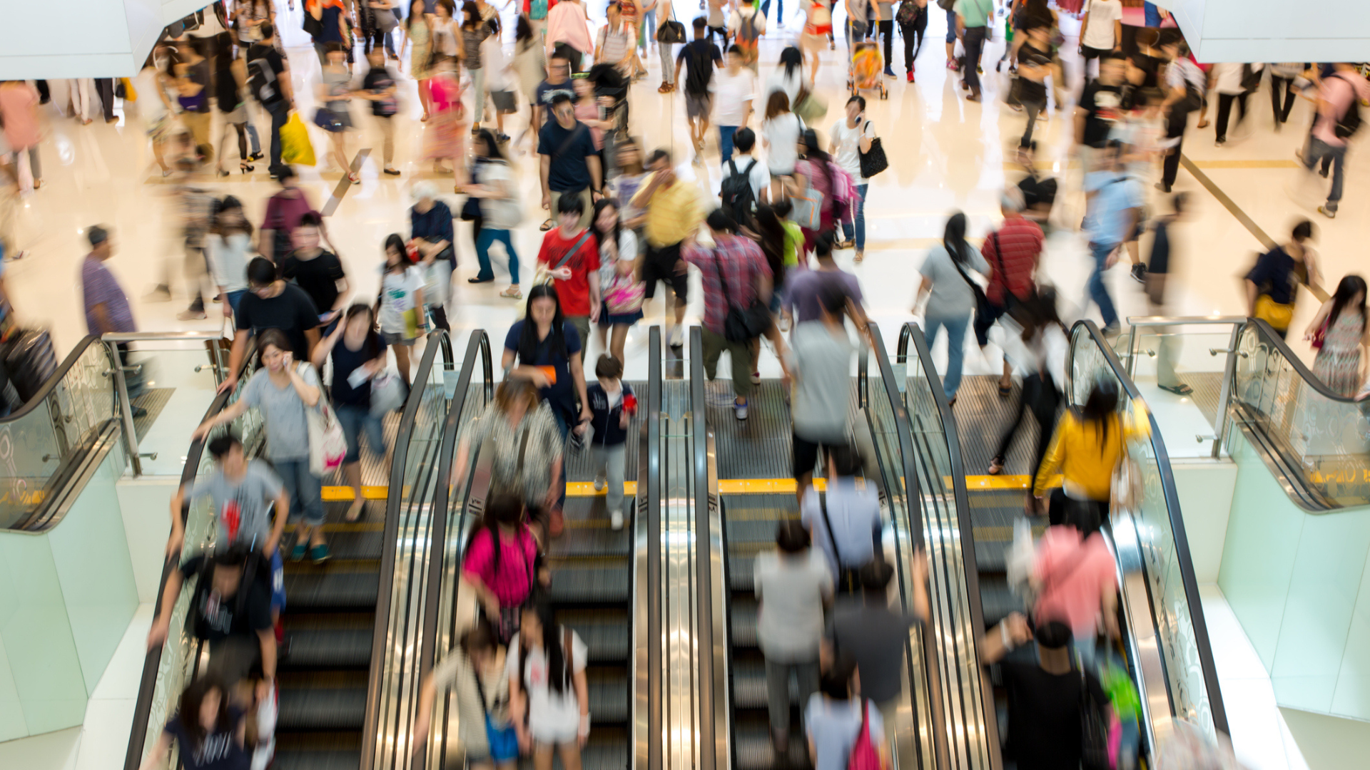
What we have survived and the permanent loss so many have experienced will not be easily forgotten. The sense that we have made it through something so awful together will tighten the community bonds. The support that communities have shown for local businesses this past year has been amazing to see and has only strengthened the local connection. The optimism, anticipation and hope to support our local restaurants and retail shops is there, and we cannot wait to celebrate with our communities in person.[/vc_column_text][movedo_empty_space][movedo_single_image image=”30071″][movedo_empty_space][vc_column_text]The pairing of a constant muted tone alongside a bright splash of color aligns quite well with how I think retail/restaurant spaces will approach 2021. We will be recovering and learning to live differently; we will want to have the concrete, recognizable, and familiar but will also be looking for the new, surprising, and transformative.
The idea of togetherness will continue to be a trait highlighted throughout retail and restaurants. Deepening the connection and purpose of community, one will feel when interacting with these spaces/brands—the sense of familiarity and home.[/vc_column_text][/vc_column][/vc_row][vc_row][vc_column][movedo_single_image image=”30069″][movedo_empty_space][vc_column_text]The desire and search for something new and bright to uplift our spirits will be at the forefront of people’s minds when stepping back into the retail world. The sense of discovery, wonderment, or even looking at something through a new lens will be key in sating the craving for escape and experiencing something new.[/vc_column_text][movedo_empty_space][movedo_quote quote_style=”line”]”The union of an enduring Ultimate Gray with the vibrant yellow Illuminating expresses a message of positivity supported by fortitude. Practical and rock-solid but at the same time warming and optimistic, this is a color combination that gives us resilience and hope. We need to feel encouraged and uplifted; this is essential to the human spirit.” – Leatrice Eiseman, Executive Director of the Pantone Color Institute[/movedo_quote][movedo_divider][movedo_empty_space][vc_column_text]
Are you ready for retail to return? Check our series, Preparing for Next, for insights and creative thought starters to help brands remain relevant and get ahead.
Photos: @morkovkina_sanechek | Jason Naylor via Instagram | @alinabuzunova | @dalla_mia_finestra | @south_nostalghia | @criene | @OlgaPink [/vc_column_text][/vc_column][/vc_row][vc_row][vc_column][/vc_column][/vc_row]