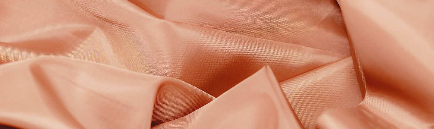
Have you been seeking comfort, warmth, and joy in the new year? According to our very own designer Zach Uhazy, the 2024 Pantone Color of the Year Peach Fuzz—a velvety peach tone—is here and it does not disappoint.
Peach Fuzz evokes a sense of elegance and enduring charm while transcending trends and staying a design classic. It’s modern yet traditional all at once. But most of all, it’s both comforting and intimate—adjacent to a “grown-up Rose Gold,” Zach says.
Snuggled between pink and orange on the color wheel, Peach Fuzz offers solace and comfort at a time when there is uncertainty in various areas of our lives. “Peach Fuzz is tranquil, like a rosewater bath or a blanket you just took out of the dryer. It feels like the blush you get on your cheeks coming inside after being out in the cold,” Zach says.
In seeking a hue that echoes our innate yearning for closeness and connection, we chose a color radiant with warmth and modern elegance. A shade that resonates with compassion, offers a tactile embrace, and effortlessly bridges the youthful with the timeless.” – Leatrice Eiseman, Executive Director, Pantone Color Institute
– Leatrice Eiseman, Executive Director, Pantone Color Institute
How should retail designers use this color for a modern refresh? How should brands adapt it to attract shoppers to their products and stores? Here are some of our predictions and recommendations for applications of Peach Fuzz in retail.
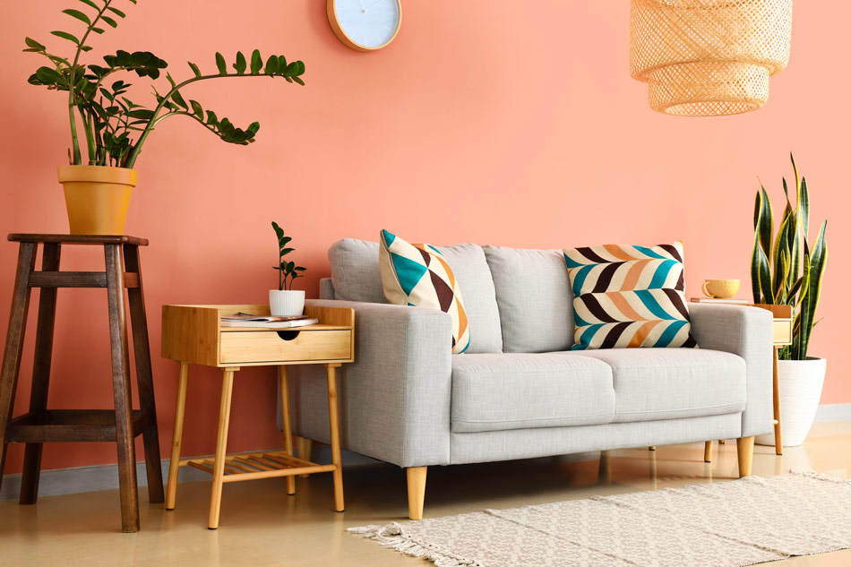
Peach Fuzz in Retail Design
Peach Fuzz can usher in a feeling of love, ease, and support in the right spaces within the retail environment. The gentle and soothing color can envelop a space like a warm hug or be used in moderation to highlight spaces for intimacy and care.
It’s the perfect complement to those moments in the customer journey when we want to communicate ease and help guests slow down—and many shoppers today say they appreciate a calmer shopping experience. “Blanketing a part of the store in soft tones and materials can help guests relax and feel comfortable—a welcome antidote to the hustle and bustle of busy shopping centers,” Zach says.
Designer’s Take: Use it with muted, calming colors or even pair it with a chromatic palette to add an element of excitement or inject warmth and care into select areas of the retail space.
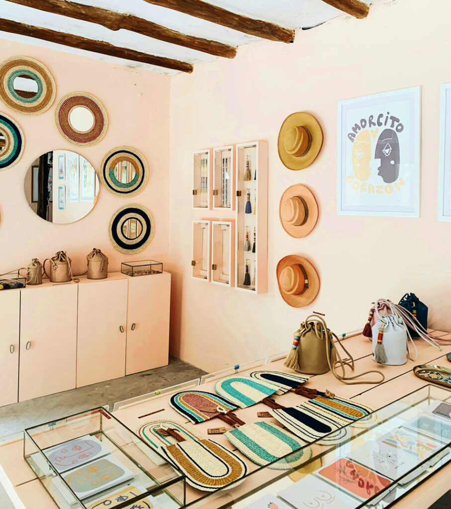
Peach Fuzz in Materials
Introducing soft and cozy Peach Fuzz into retail store interiors creates a welcoming ambiance. Beckoning us to reach out and touch, this peach hue is prominent across many textures, from suede to velvet, quilt, and fur. Its soft-to-the-touch aesthetic is both alluring and comforting.
“Translucent materials that play with lighting in the space can cast beautiful shadows in a fun way, ushering in the warmth of Peach Fuzz without coating the space in it,” Zach says.
Designer’s Take: Use Peach Fuzz on textural building elements within the retail space to add layers of depth and dimension. Avoid blanketing a space with Peach Fuzz, because without the accompanying texture, the color can fall flat.
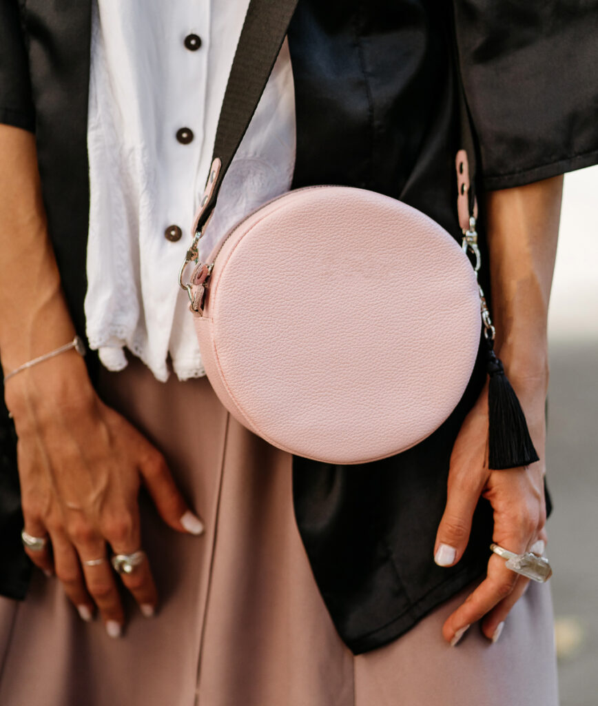
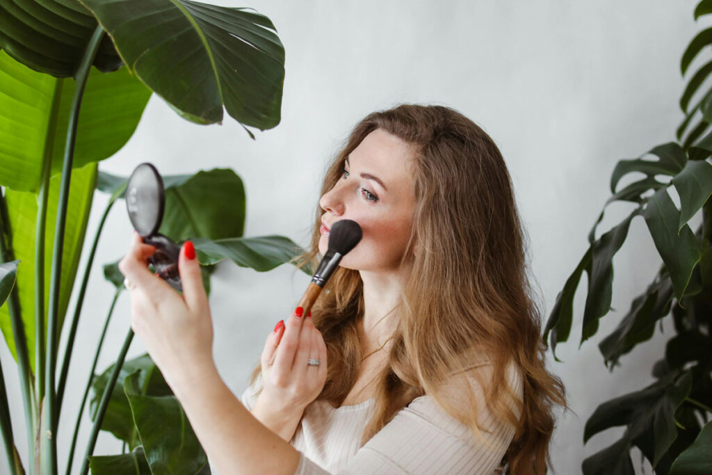
Peach Fuzz in Fashion
Consumers are embracing comfort and warmth by wearing Peach Fuzz. Whether boldly rocking a monochromatic peach-toned ensemble or incorporating the cozy tone in accessories or patterns, Peach Fuzz is the answer to today’s bland neutrals.
“We’ve seen the growth of pink fashion since Barbie, but I don’t expect to see bright garish statement pieces that were common in the 2010s in Peach Fuzz,” Zach says. “Rather, I could see this showing up in accessories, bags, casual clothing, and athleisure.”
Designer’s Take: Wear Peach Fuzz minimally to maximize its impact. Choose peach-hued accessories or one statement piece. The contemporary peach tone exudes a subtle, gentle lightness and glow that everyone wants right now. It’s a color that adds an ethereal, reflective touch to hair, creating a natural, rosy glow that complements various skin undertones beautifully. It livens up the skin, giving eyes, lips, and cheeks a soft, warm touch that enhances overall vitality.